Craigslist is a classified advertisement website that is designed to assist users in buying and selling products and services. In addition, Craigslist also allows users to search for jobs, join the discussion forums, and find/list housing
Analyze what areas of the website can be improved keeping in mind it's functionality and focusing mostly on the user interface.
Two months.
Craigslist inc - designed in 1995, has not been updated for over 25 years. Although the website may be functional, It has not kept up with modern UI design trends. I showcased some of the major critiques of their current design and architecture in the following image.

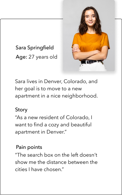
Based on the website’s reviews, I created provisional personas to begin thinking about who might make up Craigslists’s customer base. It helped me to focus on the questions I want to ask in the interviews.
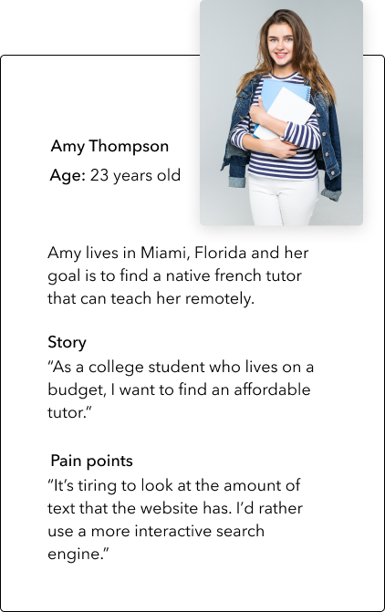
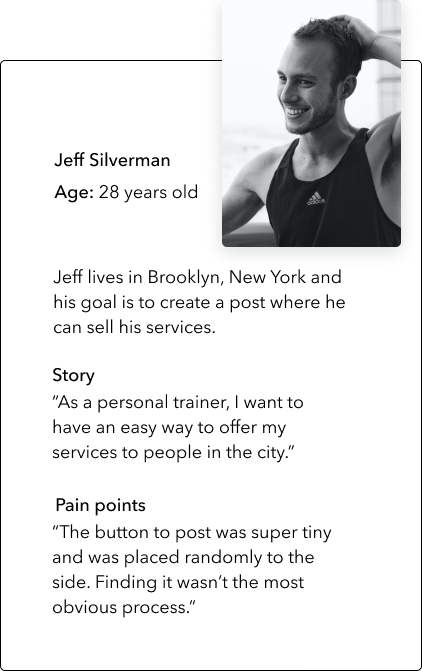
I developed a list of questions and conducted a series of interviews with people who had experience using Craigslist. These interviews helped me gain a clear understanding of people’s experiences and preferences towards a better User Interface. Some of the questions I asked were:
1.What is your first impression when landing on Craigslist.com?
2. What do you expect to gain from using the site?
3. What was the hardest task to accomplish in the process of finding an apartment to rent.
4.What would keep you from using Craigslist?

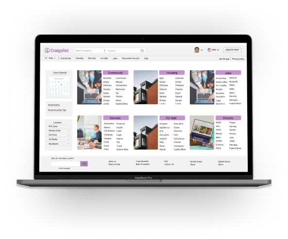
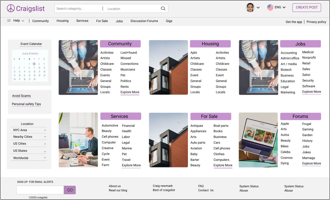
Above you will see some of the wireframes from my redesign. The main goal for the homepage was to include a useful header where users could easily access all of Craigslist’s services. After this, I also redesigned the look of the left sidebar making sure that the location filter was more visible.
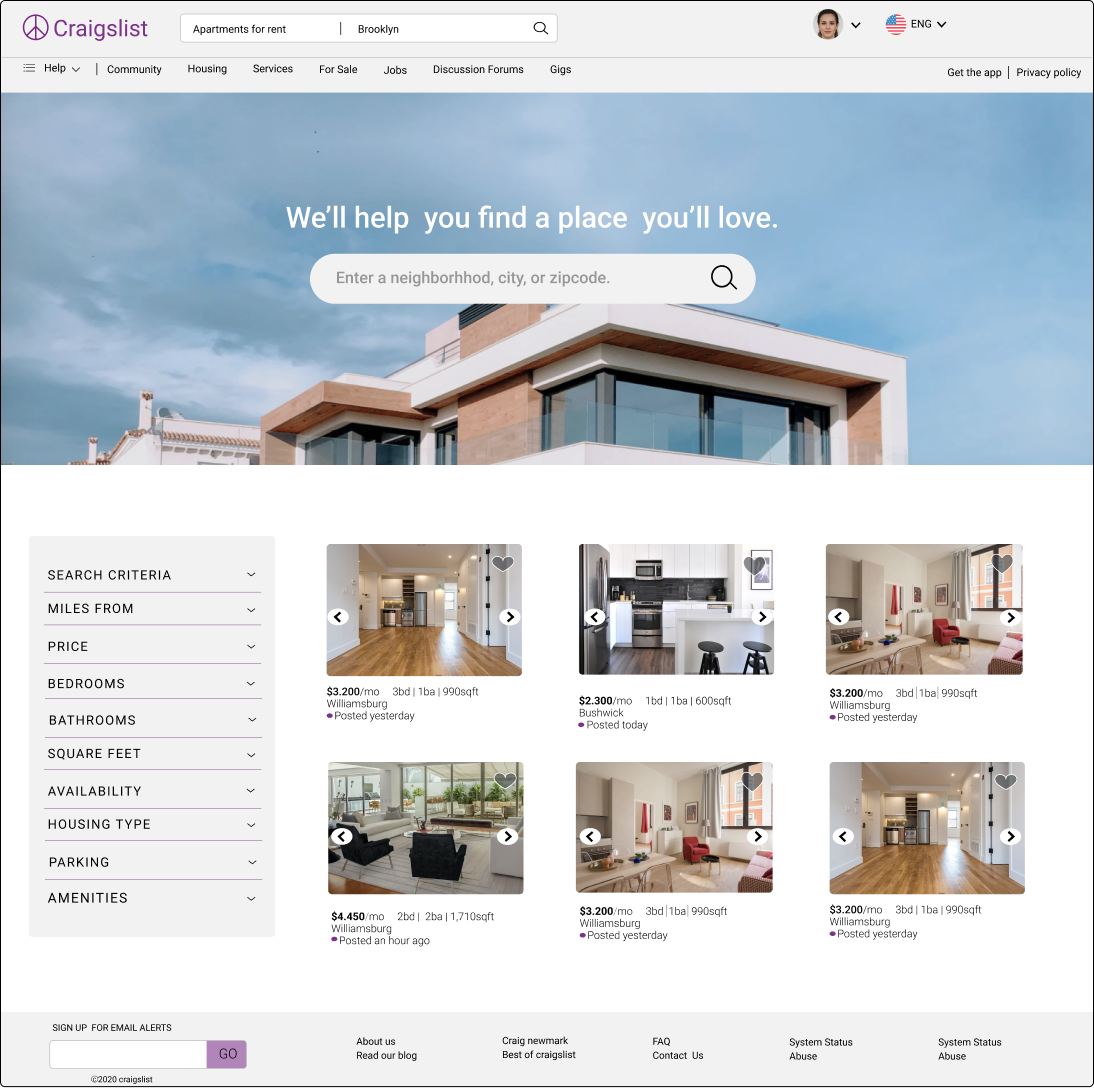
For the categories page, I went with a banner with a search engine on top, to help speed up the user experience. Each search result has a short description and the filters can be reset in the left sidebar.
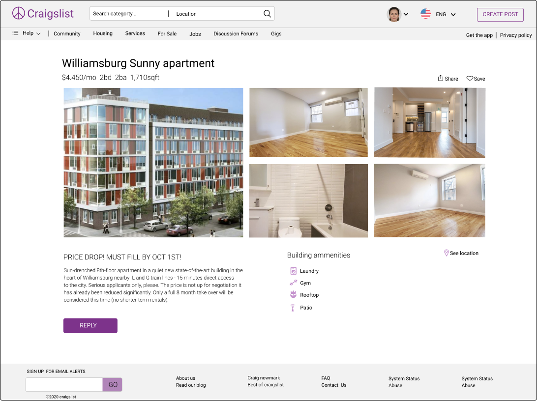
For the details page, I stuck to the main principles of design: balance, hierarchy, and white space; making sure that the call to action button was visible.
